Page Layout
The user interface of Kaseya 2 is designed to be flexible while streamlining the choices a user makes.

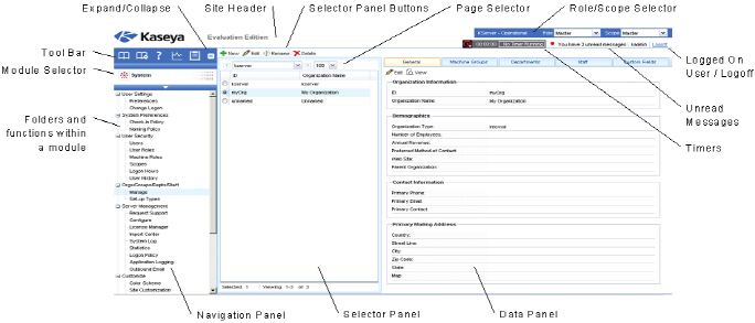
- Navigation Panel - The module tabs and function panes are combined into a single expandible-collapsible explorer like navigation panel.
- Selector Panel - Many Kaseya 2 functions display a middle selector panel to select one or more records. The selector panel can be scrolled, filtered and sorted independently from any other pane.
- Data Panel - On the right hand side of the screen, is a data panel designed as a series of tabbed views, providing quick access to each property or data view no matter how complex a function might be. Many of the tabs have fields you can edit and buttons that provide additional functionality.
- Module Selector - At the top of the navigation panel is a module selector. Clicking the visible module displays all the installed modules in the VSA. Clicking any of the other modules selects that module and displays the folders and functions within that module the user has access rights to see.
- Toolbar - The toolbar, just above the module selector, provides instant access to the global functions Show Bookmarks, Add Bookmark, Help, Status, and Notes.
- Expand/Collapse - A << icon on the right side of the toolbar collapses the navigation panel. Once collapsed a >> icon expands the navigation panel.
- Selector Panel Buttons - At the top of the selector panel is a page-specific button bar. Typically these buttons include creating, editing and deleting records listed in the selector panel. Additional buttons display, depending on the page and your logon access rights.
- Page Selector - If the selector panel list is longer than one page, the page selector enables you to browse through multiple pages. You can set the number of rows displayed on each page.
- Site Header - A customizable site logo and header text displays in the upper left corner.
- Role/Scope Selector - Selects the combination of role and scope that is currently active for your logon. If you have more than one role or scope available to you, you can switch roles or scopes anytime during your logon.
- Logged On User / Logoff - Displays the username of the user currently logged on and a logoff link.
- Unread Messages - The number of unread messages displays in the upper right corner. You can click this counter at any time to display your VSA inbox immediately.
- Timers - Records time entries that can be applied to timesheets and other work type records.

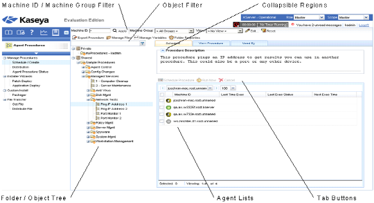
- Machine ID / Machine Group Filter - If a page displays an agent list, then the Machine ID / Machine Group filter displays at the top of the page. The filter enables you to limit the list of agents displayed on the machine, by individual machine, machine group, organization or by view definition.
- Folder / Object Trees - Certain functions display a folder tree in the selector panel instead of list of records. Typically two folder trees are provided, one Private and one Shared, but sometimes only the Shared folder tree displays. You can create new objects in these folder trees, and in the Shared folder tree, share them with other users.
- Tree Filter - All folder trees panels can be filtered by entering a string into the tree filter.
- Agent Lists - Agents lists display on many VSA pages. In the new user interface, agents frequently display in one of the tabs in the data panel on the right side of the page.
- Tab Specific Buttons - Any tab in the data panel on the right side of the page can display a tab specific set of buttons. Tab specific buttons affect the child record just below it. For example, when you want to run an agent procedure immediately, you select the procedure in the folder tree in the middle panel, then select one or more of the agents in the tab, then click the "Run Now" tab button to execute the agent procedure.
- Collapsible Regions - Panels, tabs and dialogs are sometimes segmented into collapsible regions. Clicking the down arrow lets you hide that region of the user interface. A collapsed region displays an expand button, enabling you to expand that region again.
Topic 4622: Send Feedback. Download a PDF of this online book from the first topic in the table of contents. Print this topic.